My scope at Monument
This case study goes deep on payments and the tenant portal, but it’s one part of a much bigger role. For nearly two years as the lead designer, I designed new features end to end and significantly improved existing ones across the whole platform:
- Money: payments, billing, receipts, statements, move-outs, and transfers
- Tenants: tenant profiles for single-unit and multi-unit tenants, and the tenant portal, from the home screen to self-serve move-outs
- Leads and sales: lead profiles and the leads pipeline
- Revenue: promotions, rates and rate plans, and rent increases
- Facility setup: unit groups and tiers, and access control
- The online storefront operators use to rent units on their own websites
- Design leadership: hiring and managing a designer, managing two contract designers, the design process, the design system, and AI prototyping
You can see more of this work in More from Monument.
The short version
Monument is an early-stage self-storage software company. Its two products are the Facility Management Software (FMS) that operators use to run their facilities and the Tenant Portal that renters use to manage their units.
Money touches almost every interaction between the two: rent, fees, coverage, refunds, transfers, and the final balance on move-out day. Monument was building its platform from scratch, so there was no old flow to fix. These had to be designed from the ground up to handle how storage works day to day, where one tenant can rent several units, sometimes at more than one facility.
Monument moved fast. Before launch, we were racing to a first launch date. After it, we were building and iterating on features as new customers came in, sometimes to close a deal. Most of these designs went from request to design handoff in one to three weeks, and all of them shipped.
As the lead (and for a long time, only) designer, I designed the full financial lifecycle of a tenant on both sides of the counter: collecting payment, receipts and statements, billing history, transfers, and move-outs. Across all of it, I followed one rule: always show people the math, and never make them leave the screen to find it.
The challenge
Operators had been running their facilities on older software for years. They’d only switch to Monument if it handled everything their current system did, and made it simpler.
So the challenge was getting the basics right the first time, on a startup timeline:
- Storage is messier than one tenant, one unit. A business might rent six units across two facilities, and every payment, receipt, and move-out had to work for that.
- The front desk and the portal had to match. What a manager did at the front desk had to match what the tenant saw in the portal.
- Mistakes were costly. A wrong balance or a surprise fee turns into a phone call, a refund, or a write-off.
Who I designed for
Facility managers sit at the front desk and handle payments in person, over the phone, and in the middle of everything else. They need speed, accuracy, and no surprises.
Tenants range from someone storing a couch for a few months to a business running inventory out of six units across two facilities. They need to know what they owe, pay it, and move on with their day.
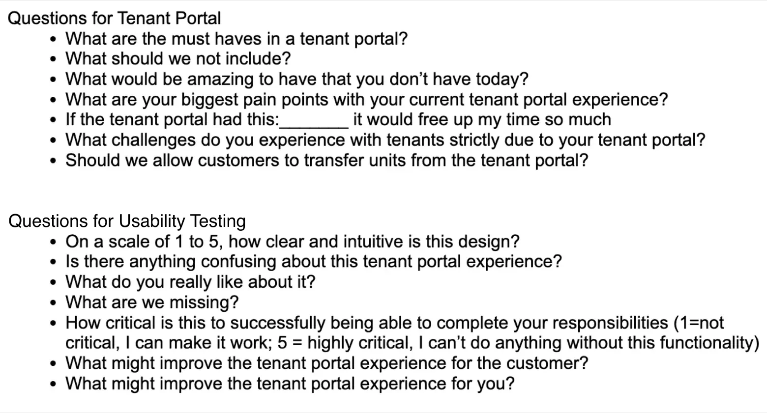
Research. Before launch, I met with the call center agents at one of our first customers, first on a call and then in person, to review our tenant portal designs and learn their biggest pain points. They take the calls when the tenant portal doesn’t work, so they knew what tenants struggled with.
Findings and insights
- One login per facilityEach facility was set up as its own company, so tenants needed a separate login for each one, and many didn't understand why. In our portal, one login shows all of a tenant's units, grouped by facility.
- Moving out without a phone callAgents wanted a low-key way for tenants to move out on their own, which became self-serve move-out scheduling in the portal.
- Switching unitsAgents wanted an easier way to move a tenant to a different unit. That became transfers, where the tenant only pays the difference between the two units.
Built with AI
1. Collecting payment: one modal, every unit
After launch · about a week from request to handoff
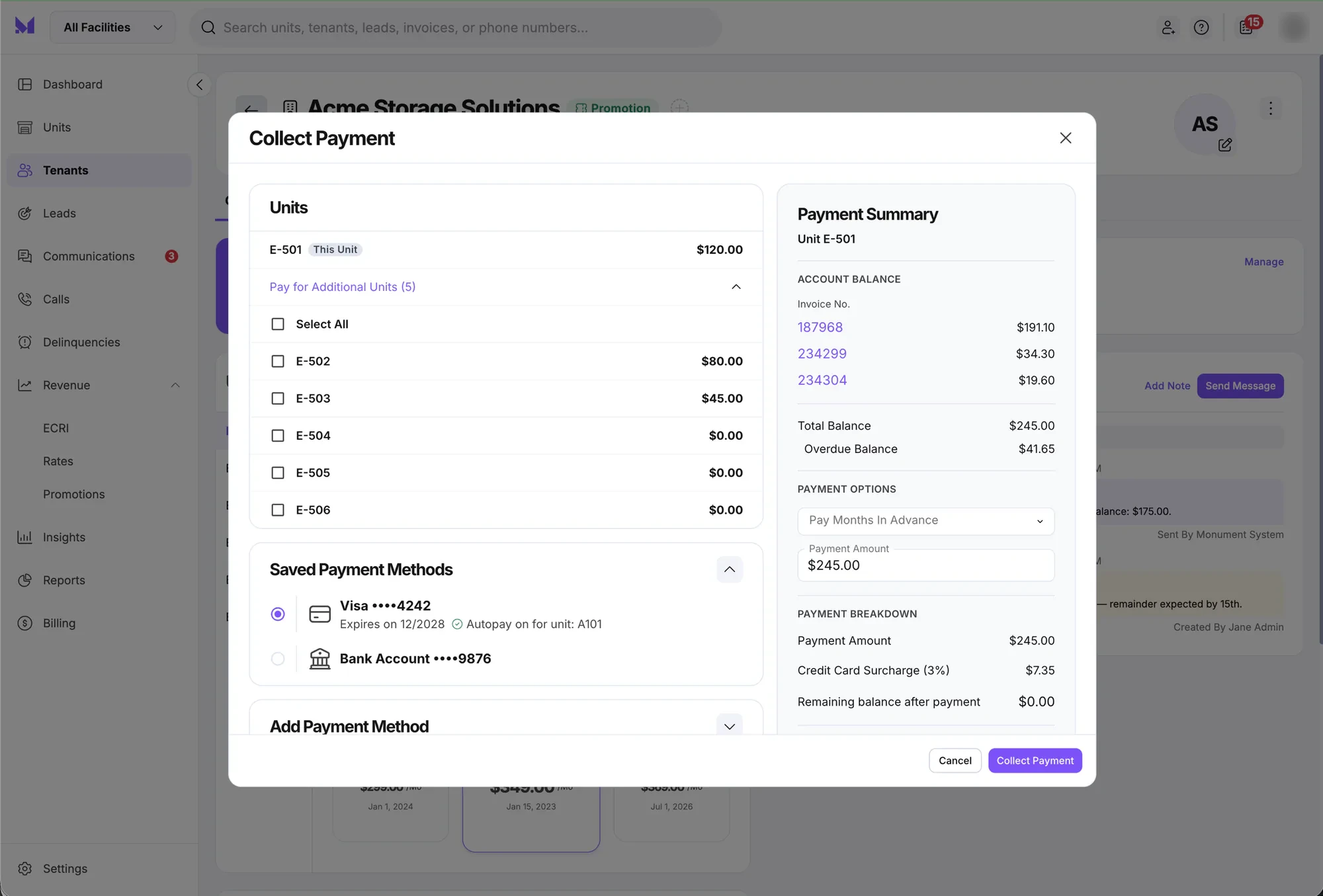
Payments started out handling one unit at a time. The new Collect Payment modal starts with the unit you’re on (“This Unit”) and lets the manager expand Pay for Additional Units to select any or all of the tenant’s other units in the same transaction.
I built it on top of the existing single-unit payment modal, using our design system components, so paying for several units would feel familiar to managers who already knew the old flow. I prototyped the whole flow in our Claude Code sandbox to check that the numbers held up everywhere else. Paying off a unit from the tenant page also has to update that unit on the units pages.
There was another direction on the table. It put a banner at the top of the modal asking if the tenant wanted to pay for multiple units, and clicking it opened a second page inside the modal to pick units. I recommended against it for two reasons: navigating between pages inside a modal is disorienting in the middle of a payment, and it added clicks to do something that fit on the first screen. It also wasn’t built from our design system, so it would have looked and behaved differently from the rest of the product.
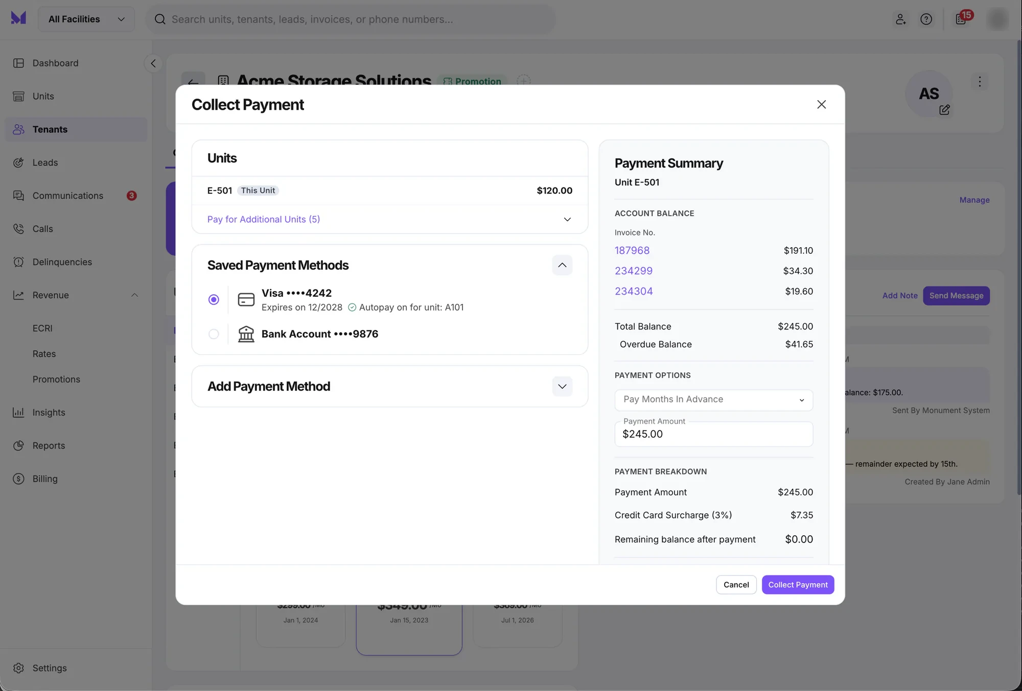
My first version listed every unit on the main screen, with the current unit already selected. When I iterated on it, I tucked the other units into an expandable section, so managers only see them when they need them. I worked out the final design with the PM, and that’s the version that shipped.
On the right, a Payment Summary stays visible the whole time:
- Account balance by invoice, with each invoice number linked
- Total and overdue balance, called out separately
- Payment options like paying months in advance
- Payment breakdown, including the credit card surcharge and the remaining balance after payment
Because of that last line, managers never have to do the math in their head or explain a surprise surcharge after the fact.
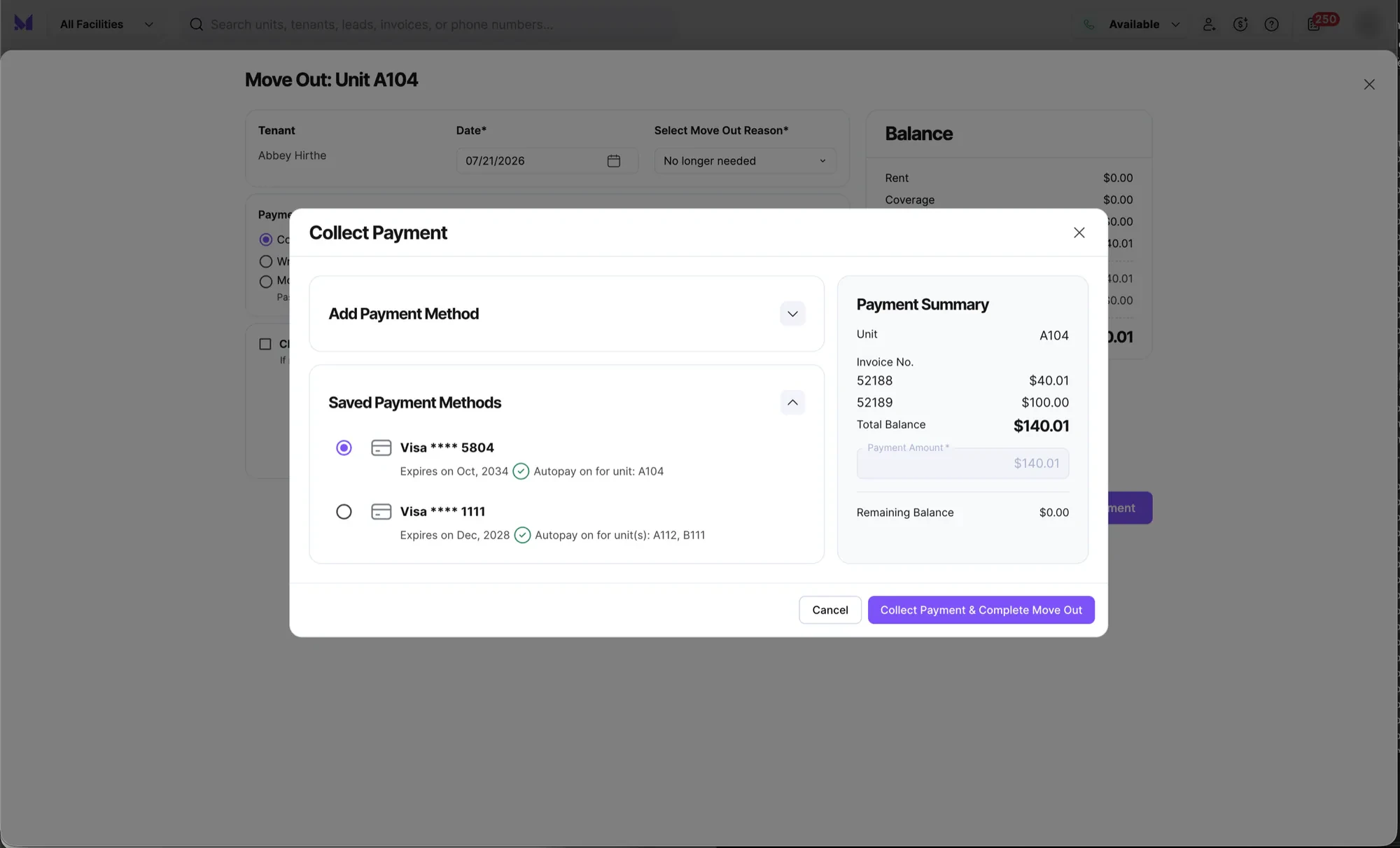
Saved payment methods show which card is on autopay and for which unit, because for a multi-unit tenant, “which card pays for what?” comes up a lot.
Built with AI
2. Receipts, statements & billing history
Before and after launch · iterated on with two PMs over time
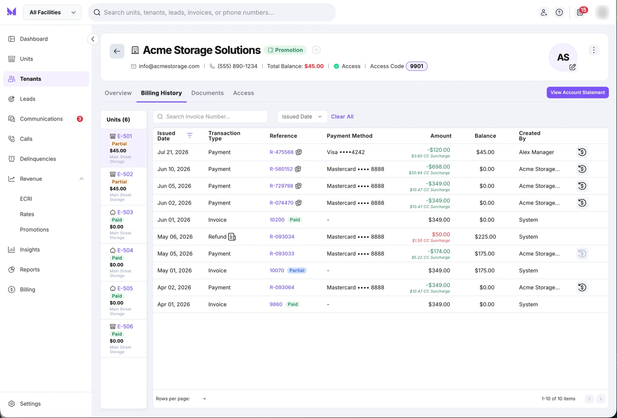
After a payment, managers and tenants need a record of it. I designed the paper trail to answer questions before anyone has to call the front desk.
- Billing History puts the tenant’s units in a left rail with status badges (Paid / Partial) and the balance for each. Picking a unit filters the ledger. Surcharges sit right under each payment amount, and refunds are one click away from the transaction they belong to.
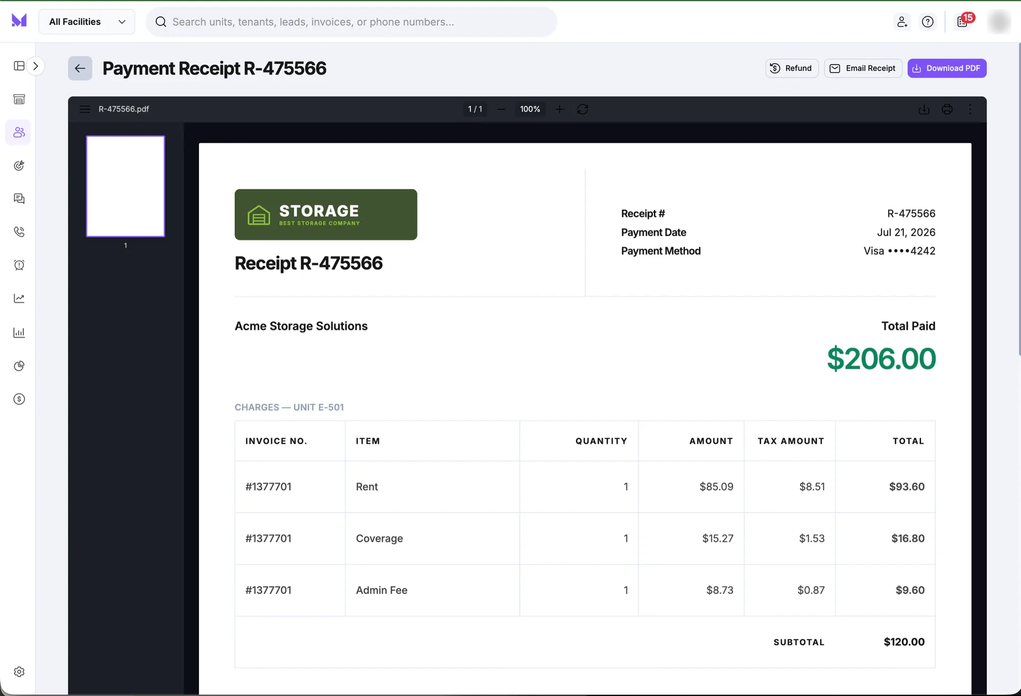
- Receipts break every charge down by invoice, item, and tax, with Refund, Email, and Download actions up top.
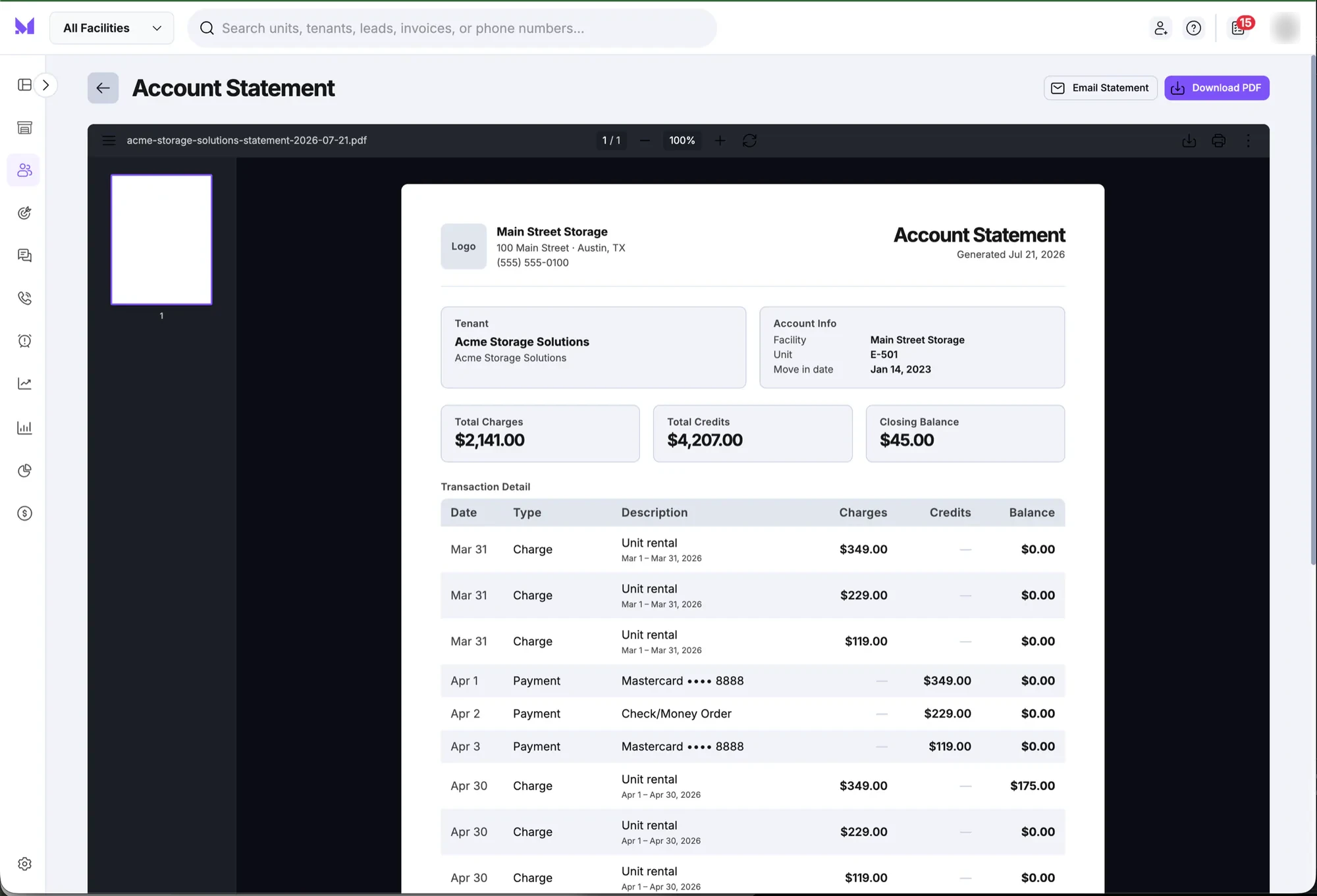
- Account Statements lead with three numbers (Total Charges, Total Credits, Closing Balance) before the line-by-line detail.
3. Move-outs: making the last interaction a good one
Before launch · one to two weeks
Move-out is where a lot of money conversations get awkward, and it’s a multi-step task with consequences. At the time, our go-to pattern for any task like this was a modal. I didn’t think a modal gave us enough room or focus for a flow this complicated, so I proposed a new component: a drawer that slides in from the side, keeps the tenant’s account visible behind it, and gives the move-out its own space.
Engineering and leadership pushed back at first. We were short on time and had to be careful with resources, and a new component meant extra work. I made the case that complex workflows like this need more space and more of the user’s focus, so they should take over the screen, and that we’d reuse the drawer over time. It was also a cleaner solution than squeezing everything into a modal. The drawer became part of the product, and we reused it many times after that.
I proposed a drawer instead of a modal for move-outs, and made the case to engineering and leadership. It became part of the product and was reused many times.
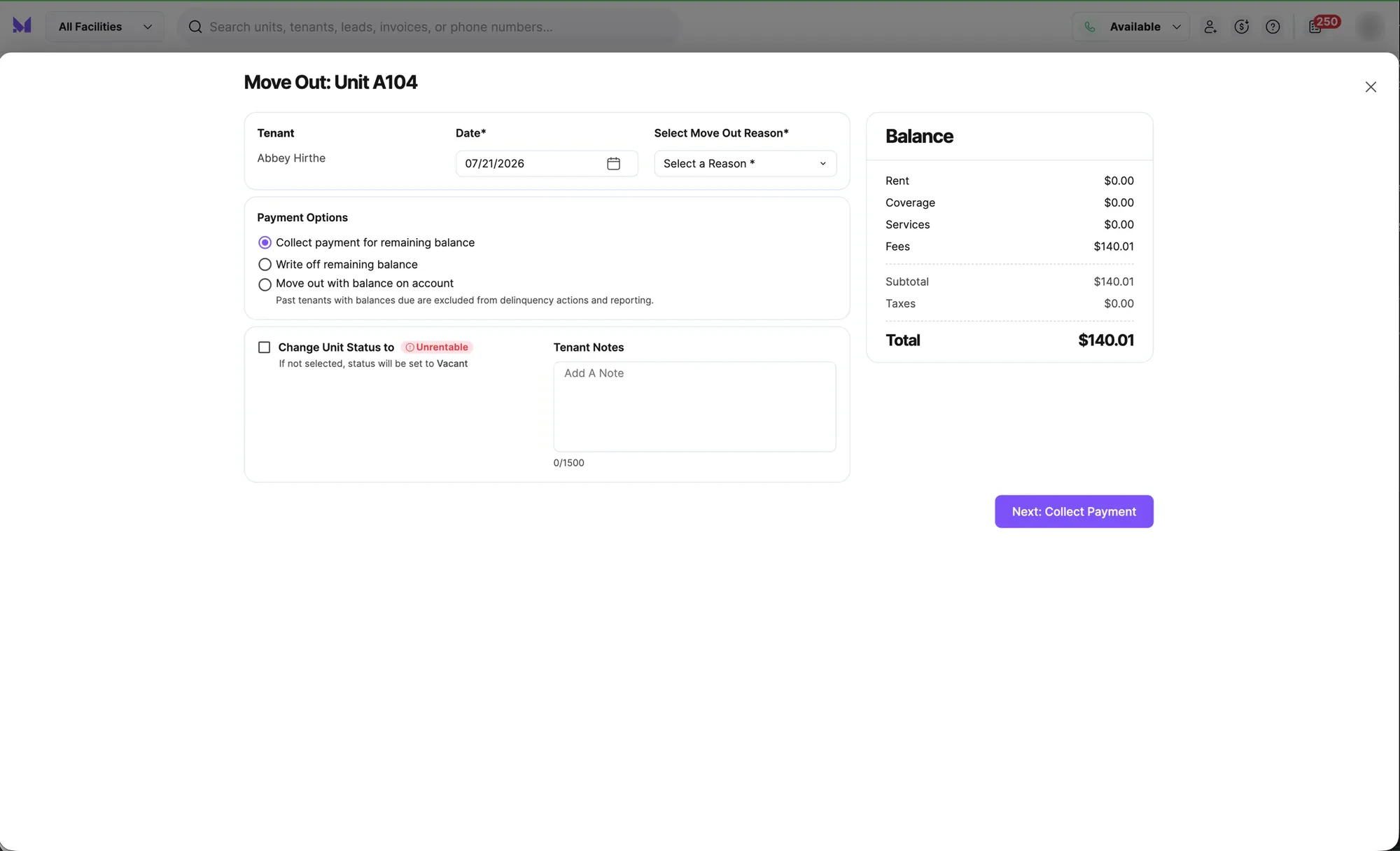
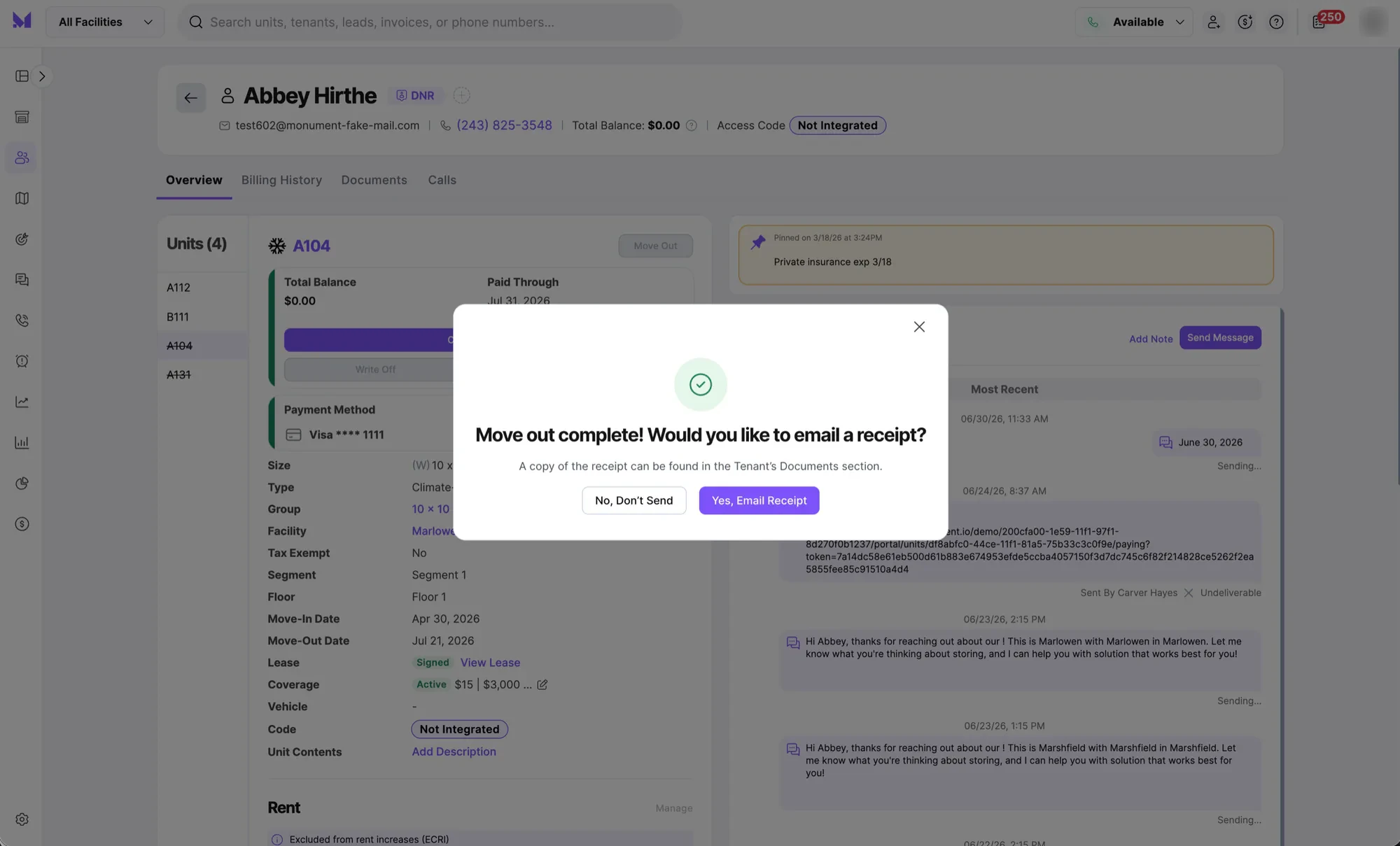
On the operator side, the Move Out drawer puts the balance front and center and gives the manager three clear choices:
- Collect payment for the remaining balance
- Write off the remaining balance
- Move out with a balance on account, with the consequence spelled out right there: past tenants with balances due are excluded from delinquency actions and reporting
I designed that helper text so managers understand the downstream impact before they choose, not after the reports look wrong. Managers can also mark the unit as Unrentable (instead of the default Vacant) if it needs cleaning or repairs, and leave a note.
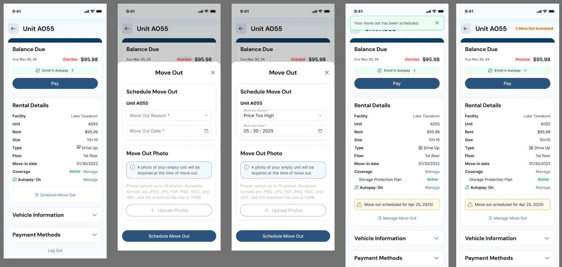
On the tenant side, I designed a self-serve flow to schedule a move-out from the portal: pick a reason and a date, upload a photo of the empty unit as proof they’ve moved out, and cancel or edit later if plans change. Operators use the move-out reasons for their marketing. Every state is designed for, from errors and the scheduled banner to photo uploads and cancellation.
Transfers, which were built on top of this move-out work, are on the password-protected page.View with password →
4. The tenant portal home: three versions, one design
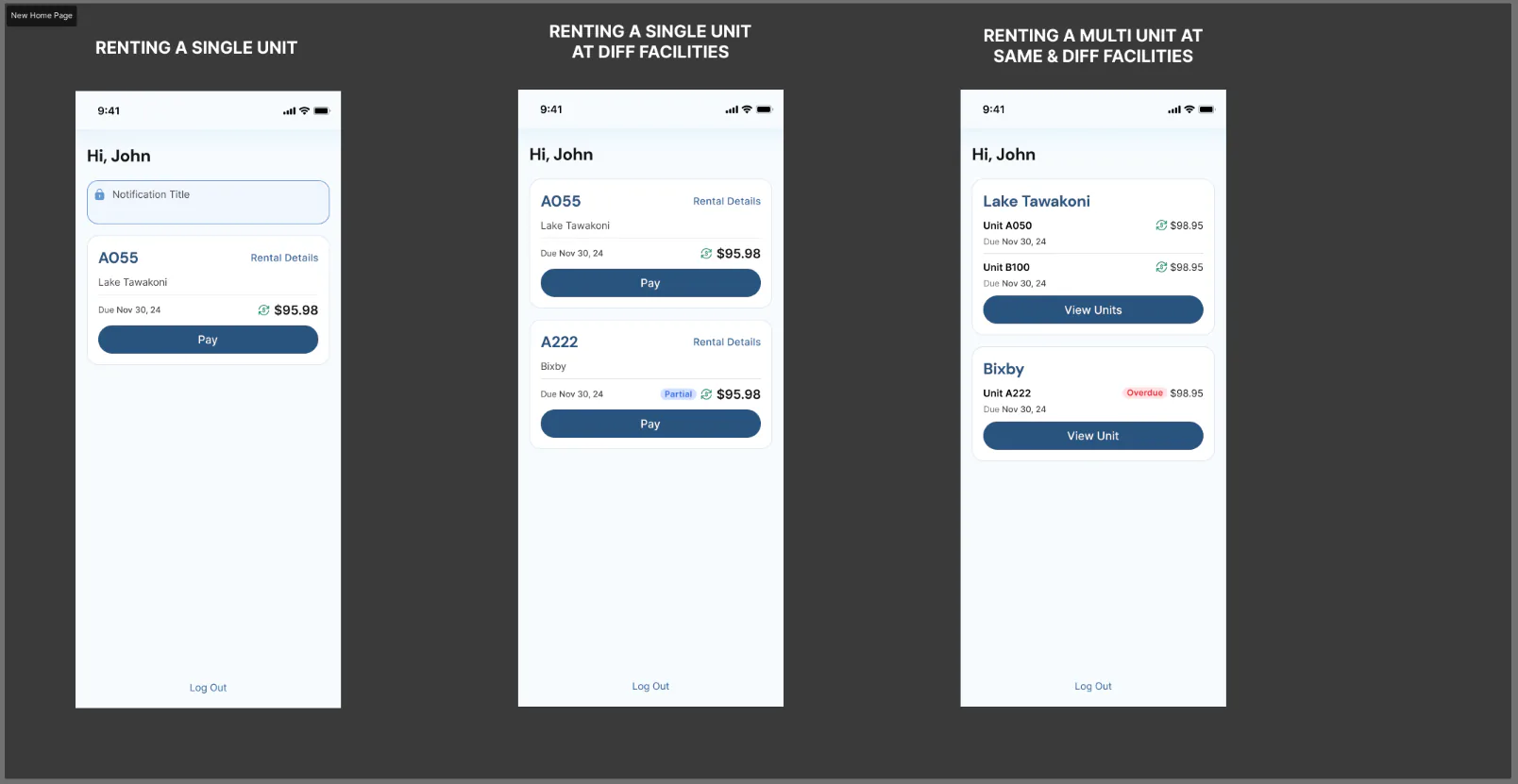
A tenant renting one unit, one renting units at different facilities, and one renting several at the same facility all need something different from the home screen. I designed three versions so each one sees the right level of detail, from a single Pay button to grouped units by facility with View Units.
This is a small part of the tenant portal, which also includes the self-serve move-out flow above. I owned the tenant portal before launch, from sign-in to autopay and alerts. I also set up its components in Figma and the design system, so the designer I hired could make updates on his own while I led other projects.
Designing it as a system
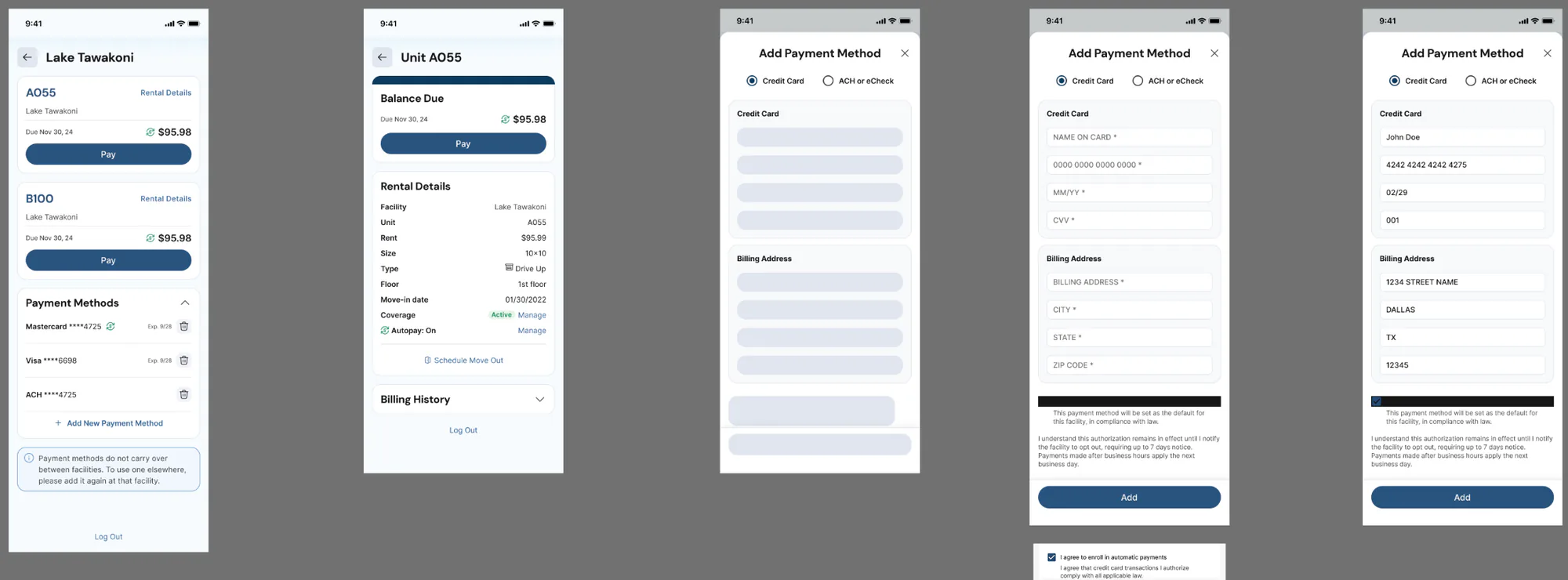
Payments show up in at least five places across two products, so I treated the pieces as shared building blocks: Saved Payment Methods, Add Payment Method, the Payment Summary/Cart panel, and status badges. Each looks and behaves the same whether you’re collecting rent, moving someone out, or transferring them, and I added them all to our component library in Storybook.
Impact
Everything here shipped, and the shared payment components and the move-out drawer were reused across the product. Move-outs, receipts, billing history, and the tenant portal were part of our first launch. Multi-unit payments, statements, and transfers came after, as new customers came on board.
Monument didn’t have analytics in place for these features yet, so most of what I know comes from customers. After launch, customers told us they were getting far fewer phone calls from tenants who needed help making payments.
Everything shipped, and customers reported far fewer calls from tenants who needed help paying.
How I’d measure success
- Payment-related support calls and tickets, before and after
- Self-serve move-outs: the share scheduled through the portal instead of at the front desk
Key learnings
Both sides of the counter need the same rules. A manager taking a payment over the phone and a tenant paying in the portal are doing the same thing, so they need to work the same way. Keeping the operator and tenant experiences in step was one of the most important parts of this work.
Decide what’s allowed before you design how it looks. Payments got complicated fast. Tenants could make partial payments, pay for some of their units or all of them, or combine both. Every option we allowed was another way to get confused, so I pushed to settle the rules early and worked through several rounds with the product director on which combinations tenants should be able to make in the portal. Agreeing on the rules first made the screens much simpler.
Some components are worth fighting for. The drawer took extra time we didn’t feel we had, and we reused it many times after. When a pattern will clearly come back, building it right the first time saves time later.