Certification & pricing platform
I was the sole designer on the platform behind the automaker’s certified pre-owned program. Program managers used it to see how the program was performing, find where vehicles were and where each one stood in certification, and manage pricing. It’s a management tool, so my job was to make a lot of operational data quick to scan and act on.
Beyond the participation rate work in my main case study, I designed:
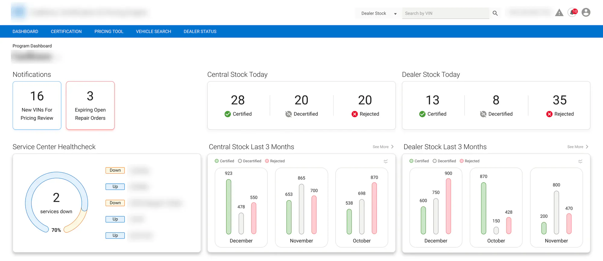
- Dashboards showing real-time inventory, certification trends, and database health
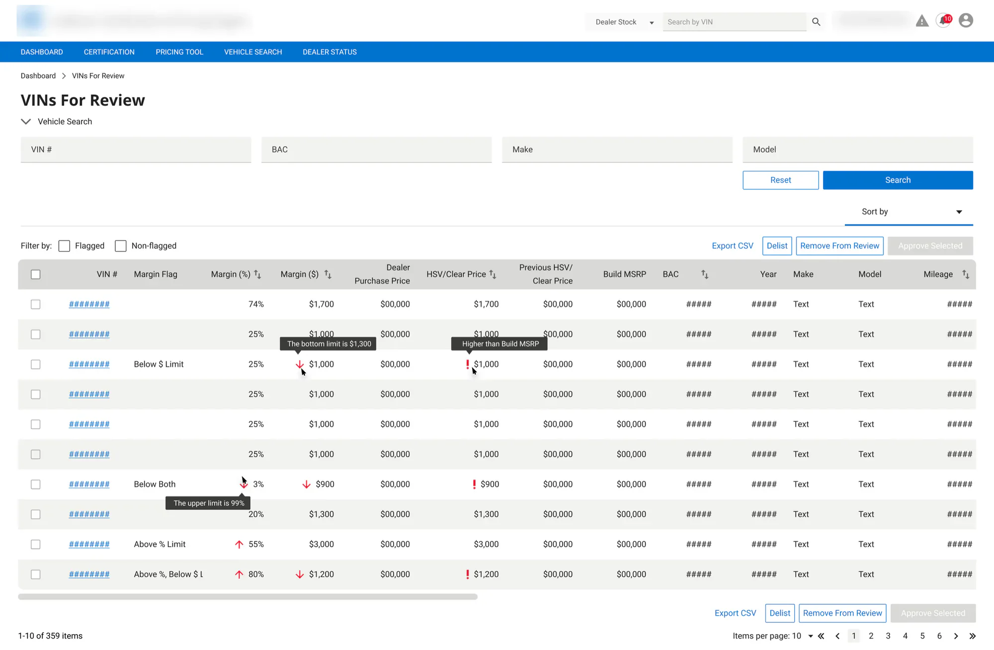
- A pricing review tool, where managers work through a queue of vehicles flagged for margin issues, then approve, remove, or delist them in bulk
- Tier and fee management, for setting up certification tiers (mileage, model years, warranties, which makes and models are included) and the fee structure behind them
- Sales and delivery reports, including a daily sales report that tracks progress against objectives
- Vehicle detail pages covering specs, history, recalls, certification, and delivery
The platform had to work on every screen size, so I wrote a responsive guide covering grids, breakpoints, and card layouts from 1920px down to 320px. I also put together a style guide and a getting-started note for developers who were new to Figma, so handoff went smoothly.
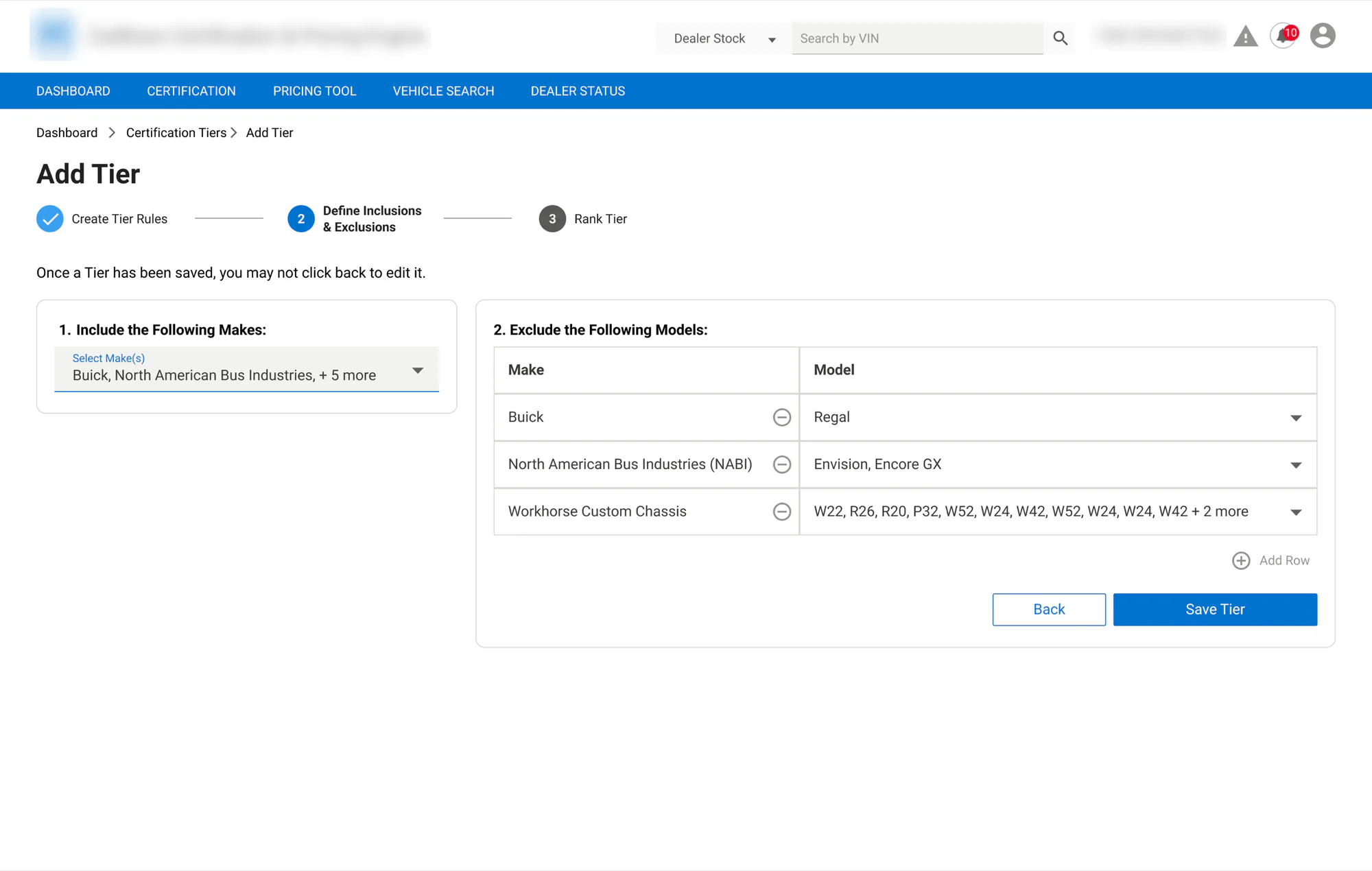
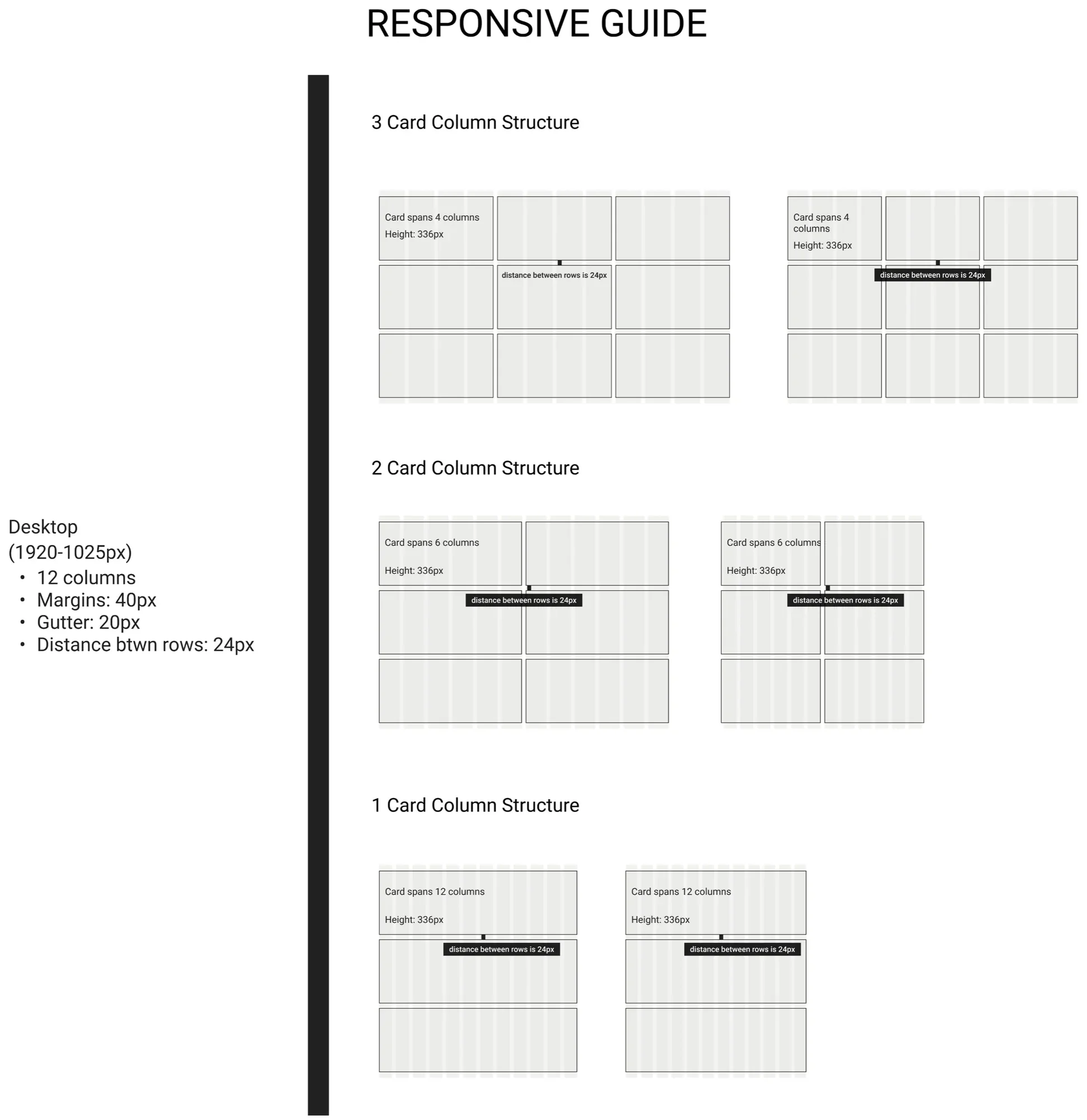
Cadillac Europe: test drive booking
Cadillac was relaunching in Europe with the LYRIQ, and the site needed to turn interest into test drives. The existing booking prompt was a small box in the center of the page, easy to miss and easy to close.
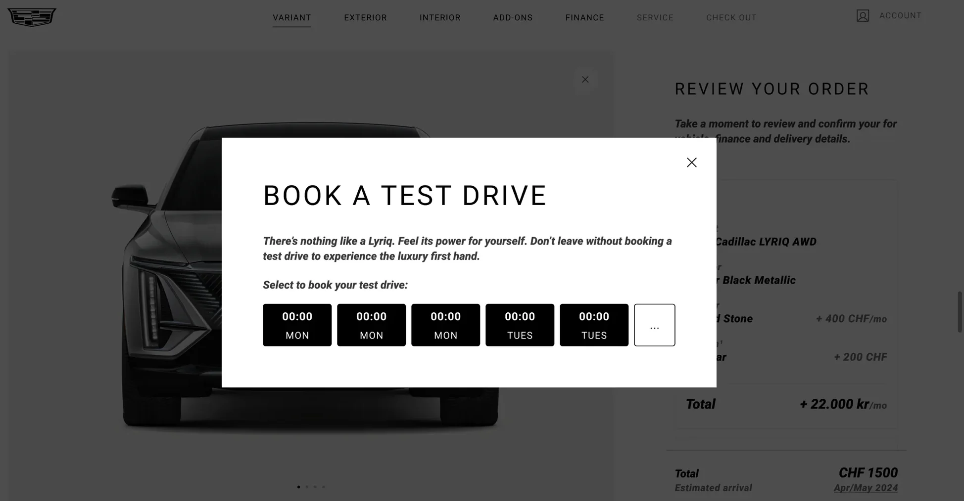
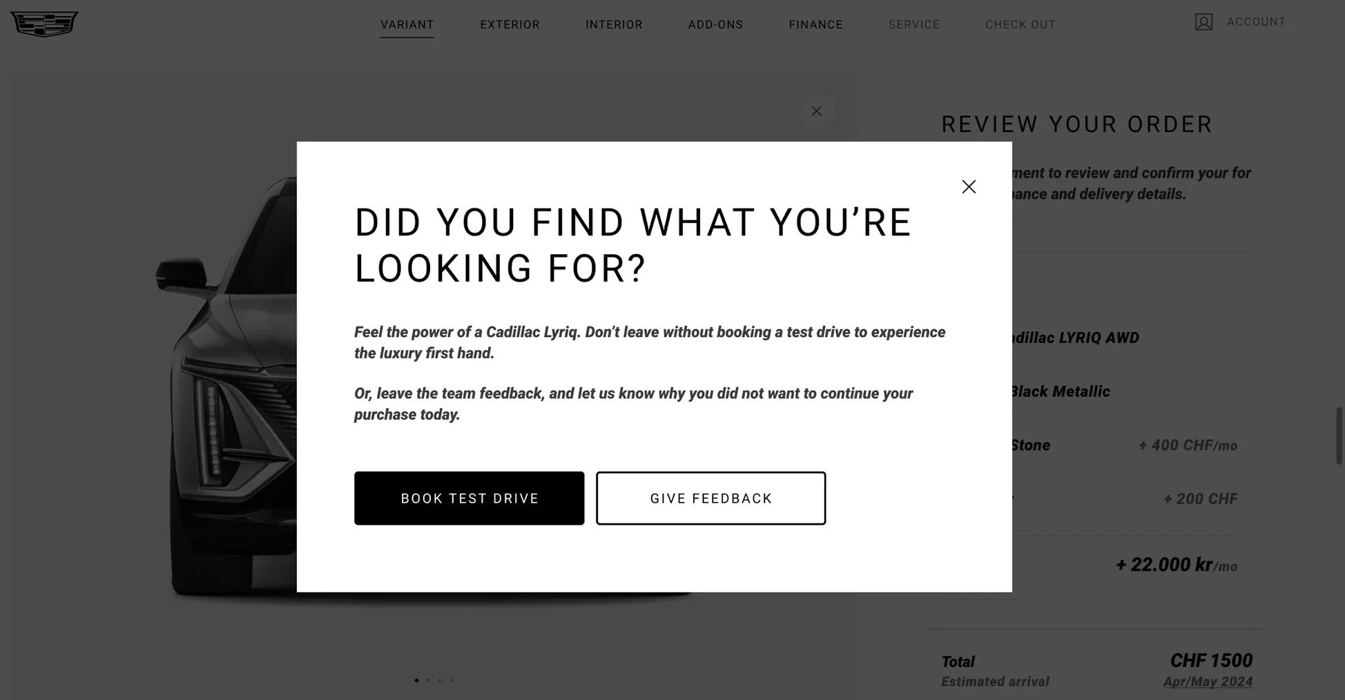
I redesigned it as a larger pop-up that catches attention and lets visitors pick a date and time right there, without leaving the page. For visitors about to leave without booking, I designed a second version that offers one more chance to book a test drive, or to give feedback on why they didn’t continue, linked to a survey so the team could learn what was stopping people.
It hadn’t launched when I handed it off. I’d measure it by test drive bookings per visit, and how often the exit version led to a booking or feedback.
myCadillac app (Europe)
On the myCadillac team in Europe, I owned the home screen for each vehicle state and the service center search, building on the app’s existing patterns.
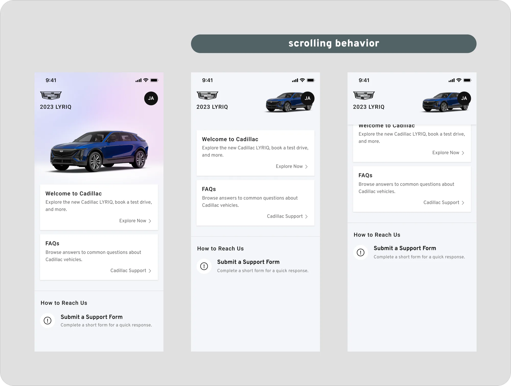
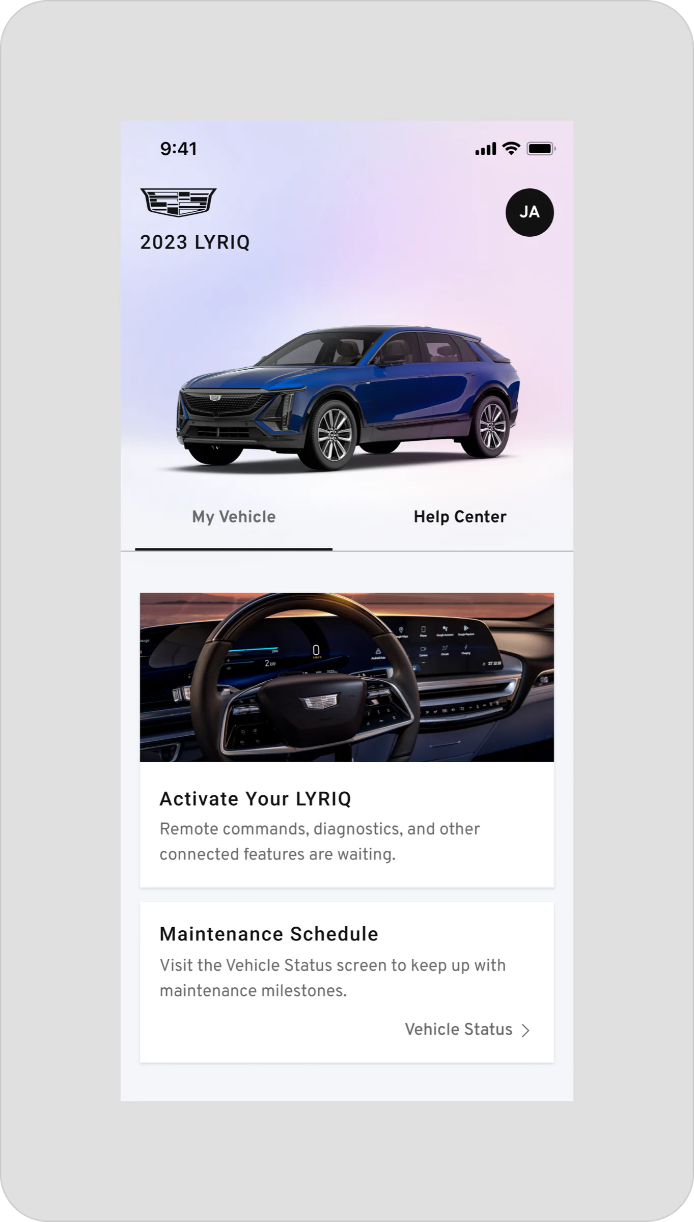
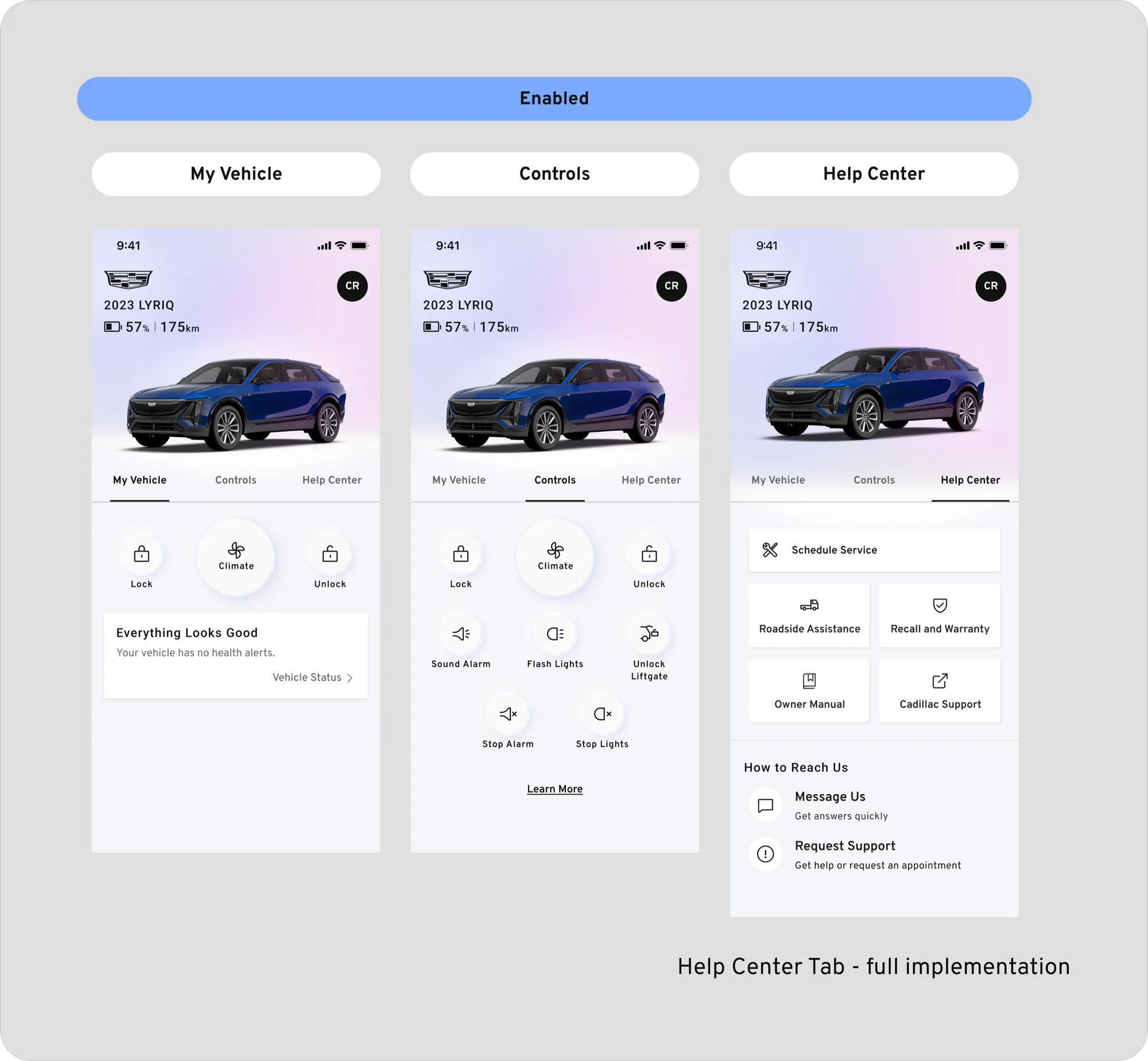
Home screen for each vehicle state. The app’s home screen changes depending on where a customer is: they haven’t linked a vehicle yet, their vehicle isn’t connected yet, or their vehicle is fully connected. I designed the home screen for each of those three states, so every customer sees the content and next steps that apply to them. I also proposed new imagery for the welcome screen.
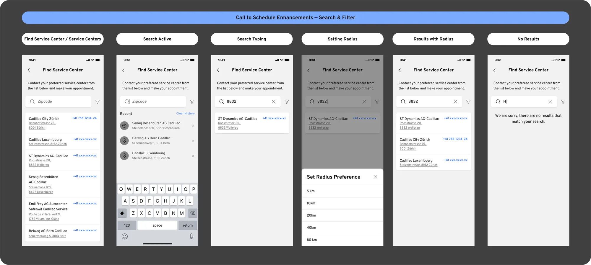
Finding a service center. When a driver needs service, such as after a low tire pressure alert, the app shows a list of nearby service centers they can call to book an appointment. Another designer had added a search to that list. I refined it so drivers search by zip code, and added a distance filter so they can choose how far they’re willing to go, from 5 to 80 km. I designed every state of the flow, including typing, no results, and setting the distance.
Organizing 800+ screens in Figma
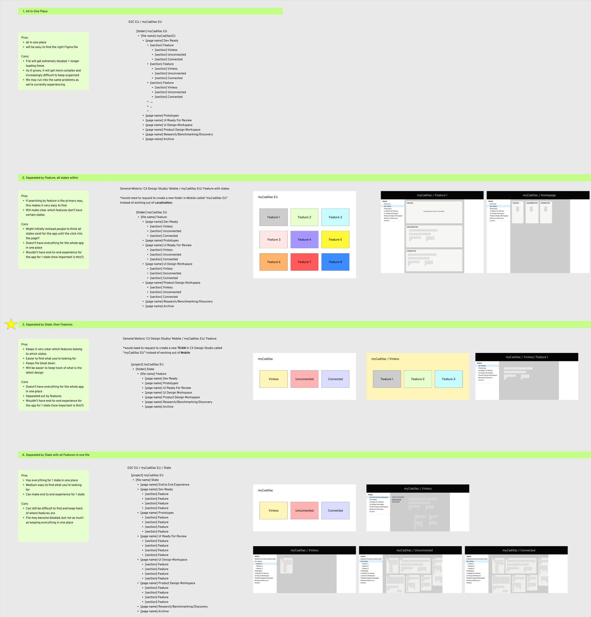
The myCadillac app team’s Figma files had grown to more than 800 screens, and finding the right, current version of a design was slow and error-prone. I put together four ways to reorganize them, each with its pros and cons. For example, keeping everything in one file is easy to search, but the file gets bloated and slow, and ends up with the same problems we already had.
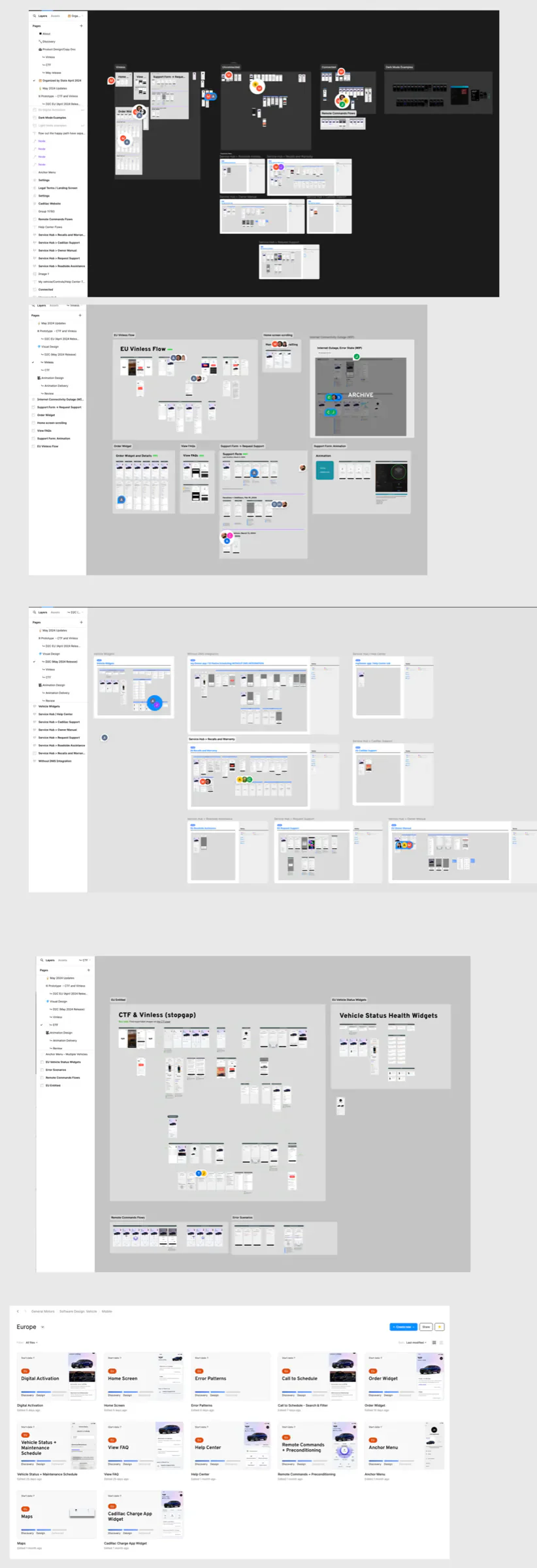
The team went with organizing by vehicle state first, then by feature. The app looked different depending on the driver’s vehicle state: no vehicle linked yet, a vehicle without connected services, or a connected vehicle. Not every feature existed in every state, so this made it clear which designs belonged where. Within each file, pages followed the design process: research and discovery, design workspaces, ready for review, prototypes, and dev ready, plus an archive.
I did similar work later at Monument, where I reorganized Figma into per-feature files with templates. When people can find the current design, every other project moves faster.